Protein that evokes a sense of home and disrupts the status quo
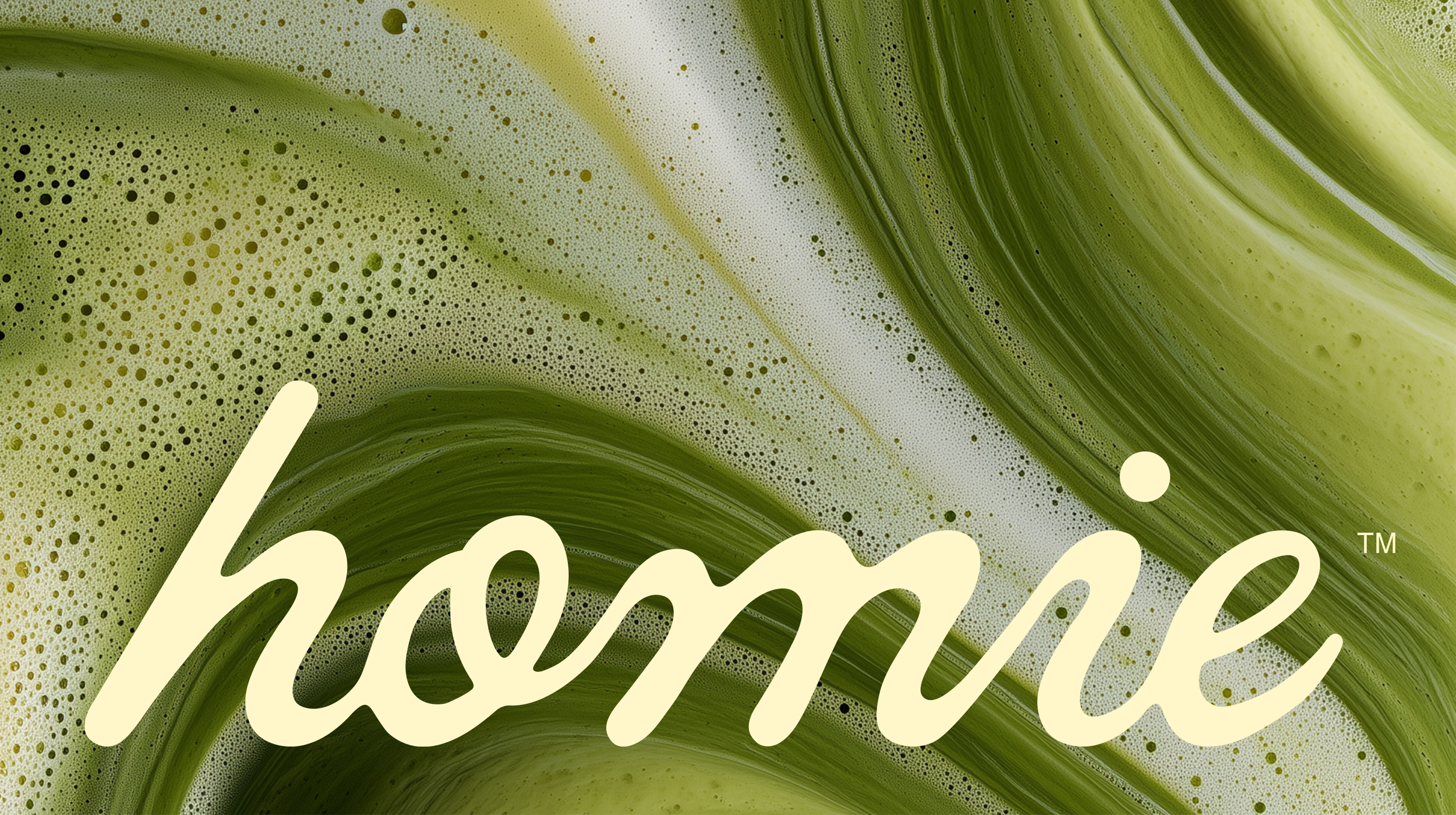
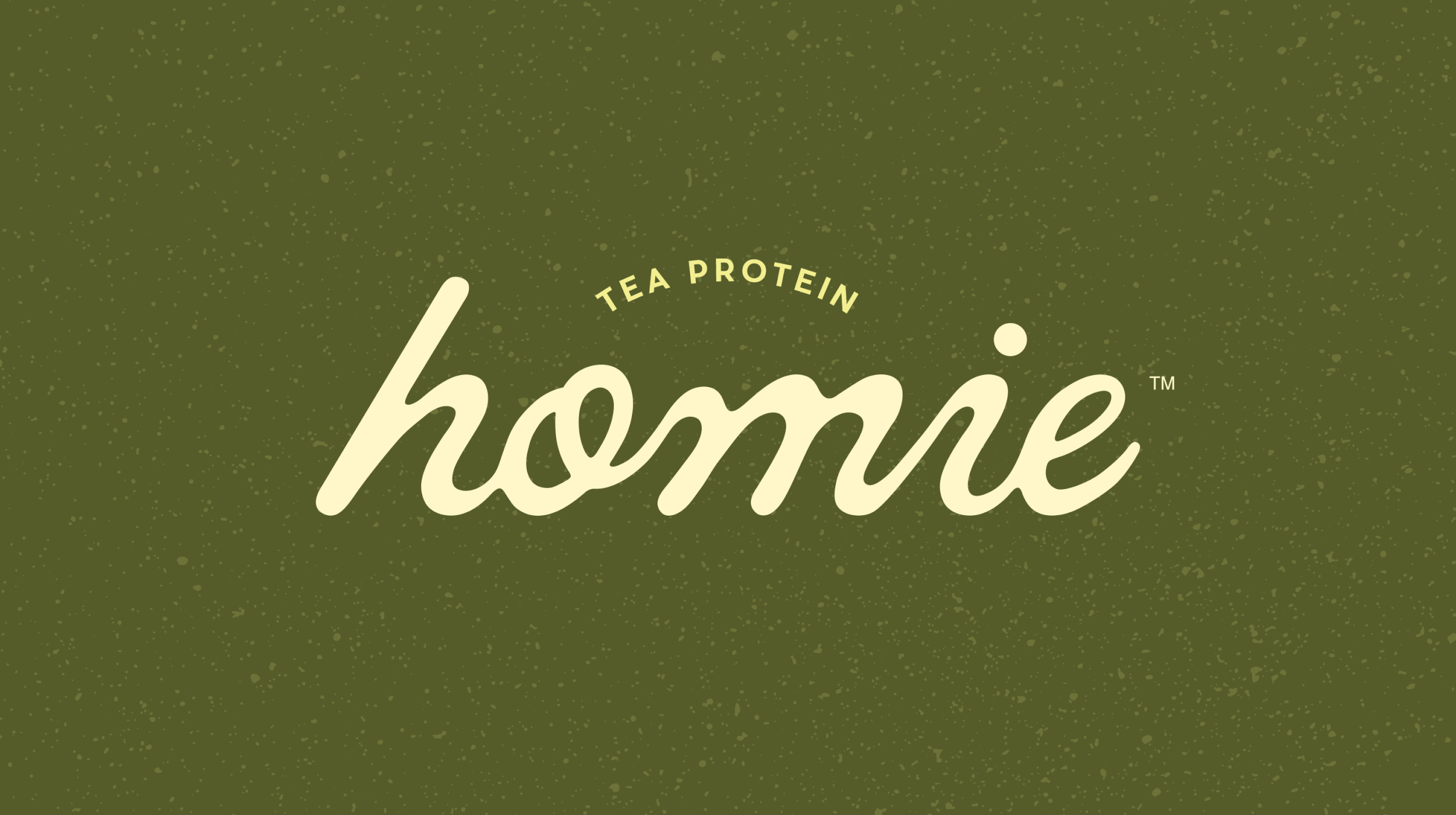
Homie
Brand Positioning, Naming, Creative Direction, Visual Identity, Packaging, Art Direction
Bringing Asian tea flavors to an uninspired protein powder category
Brief
While the protein powder industry is experiencing strong, sustained growth driven by demand for convenient, health-focused nutrition, its core flavor profiles have not kept pace and remain largely uninspired.
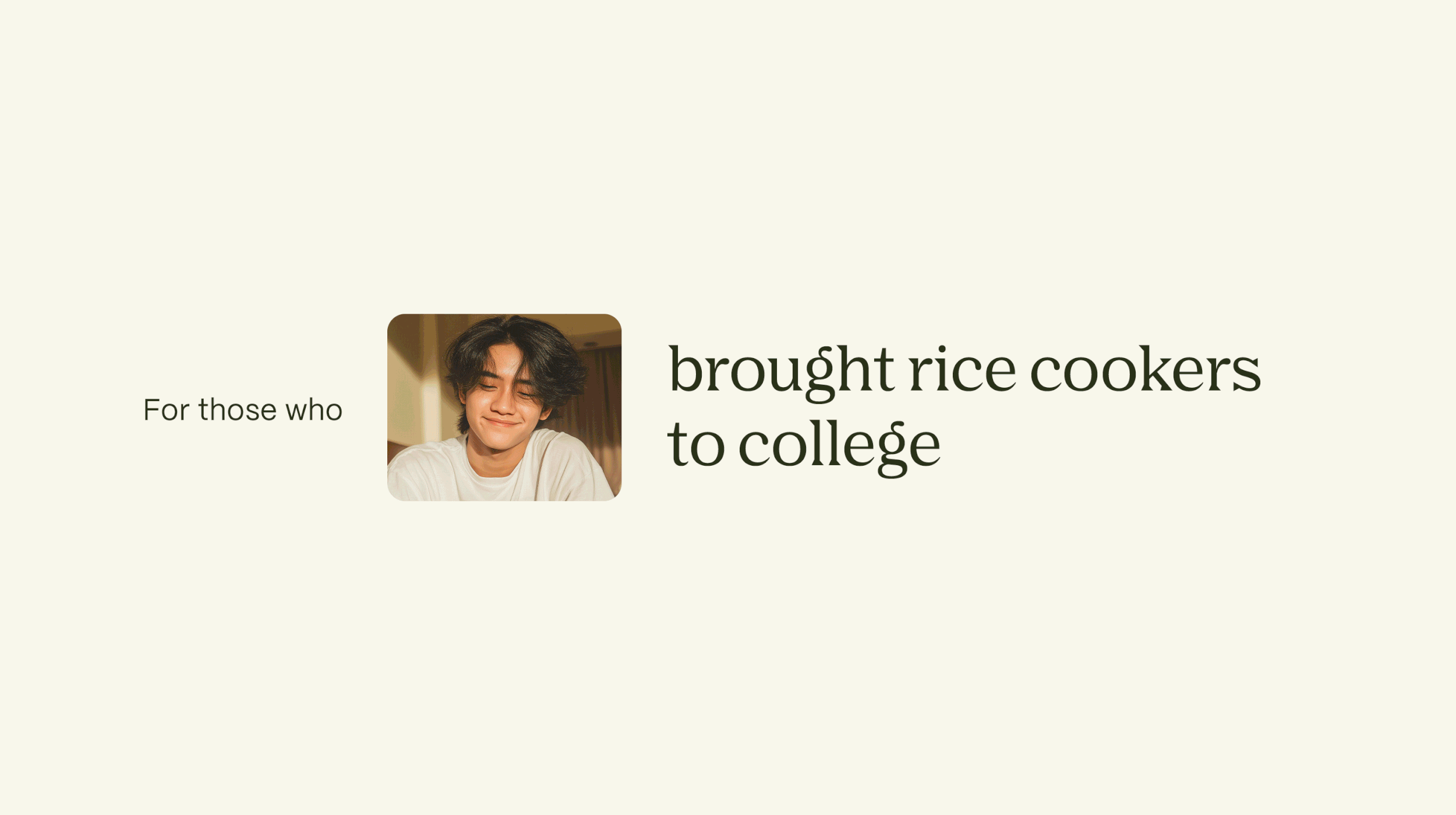
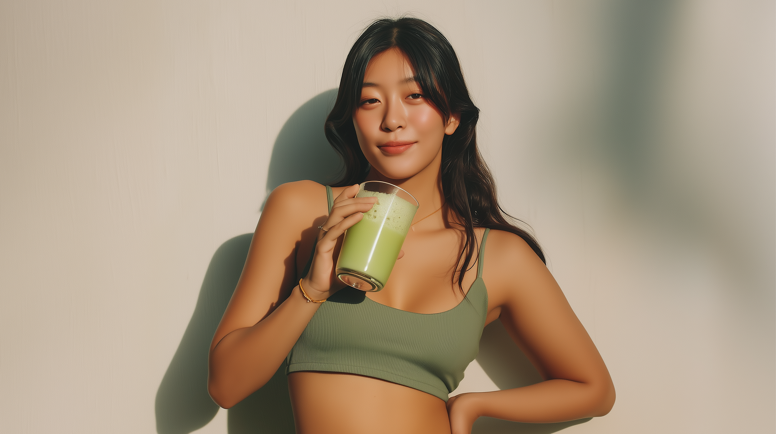
An emerging brand aims to disrupt the category by infusing multi-functional protein powder with the authentic tea-drinking traditions of Asia, offering products that fulfill the craving for familiar, home-like flavors to serve the Asian community and beyond.
To deliver the unique positioning, the brand needs a holistic narrative, from naming to visual identity and packaging design, that immerses and resonates with consumers.
Protein that represents the taste of home
Creative Direction
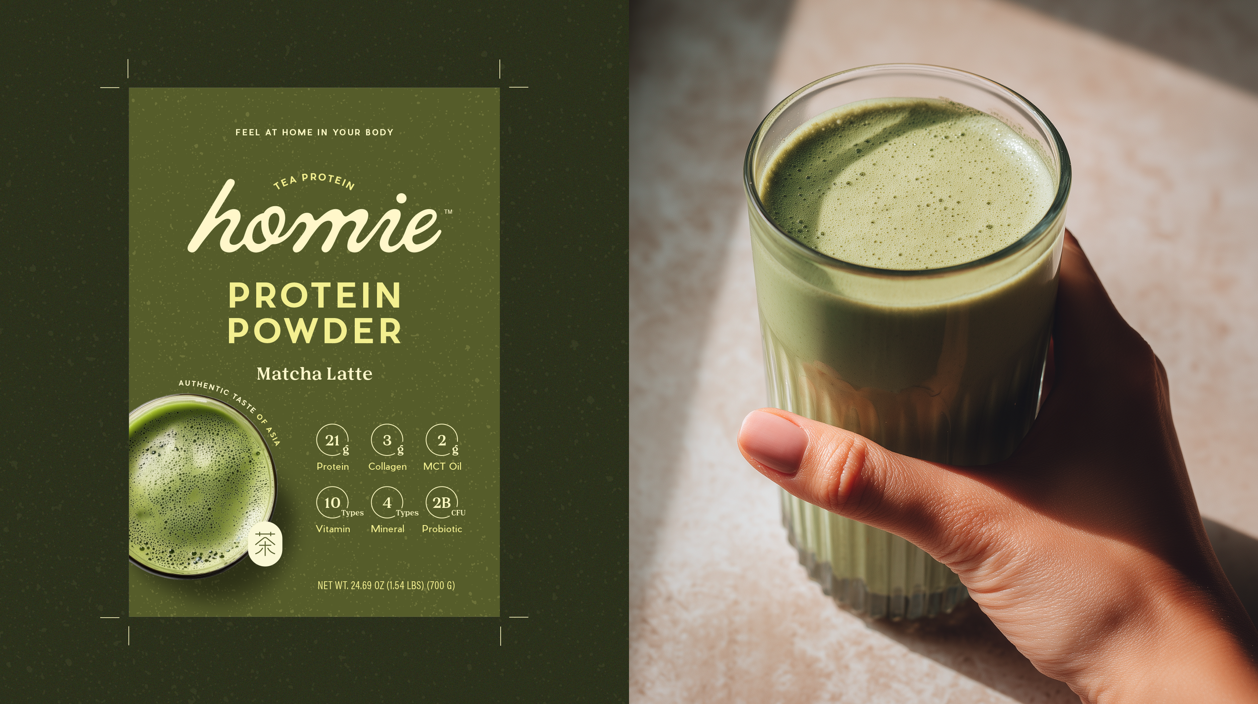
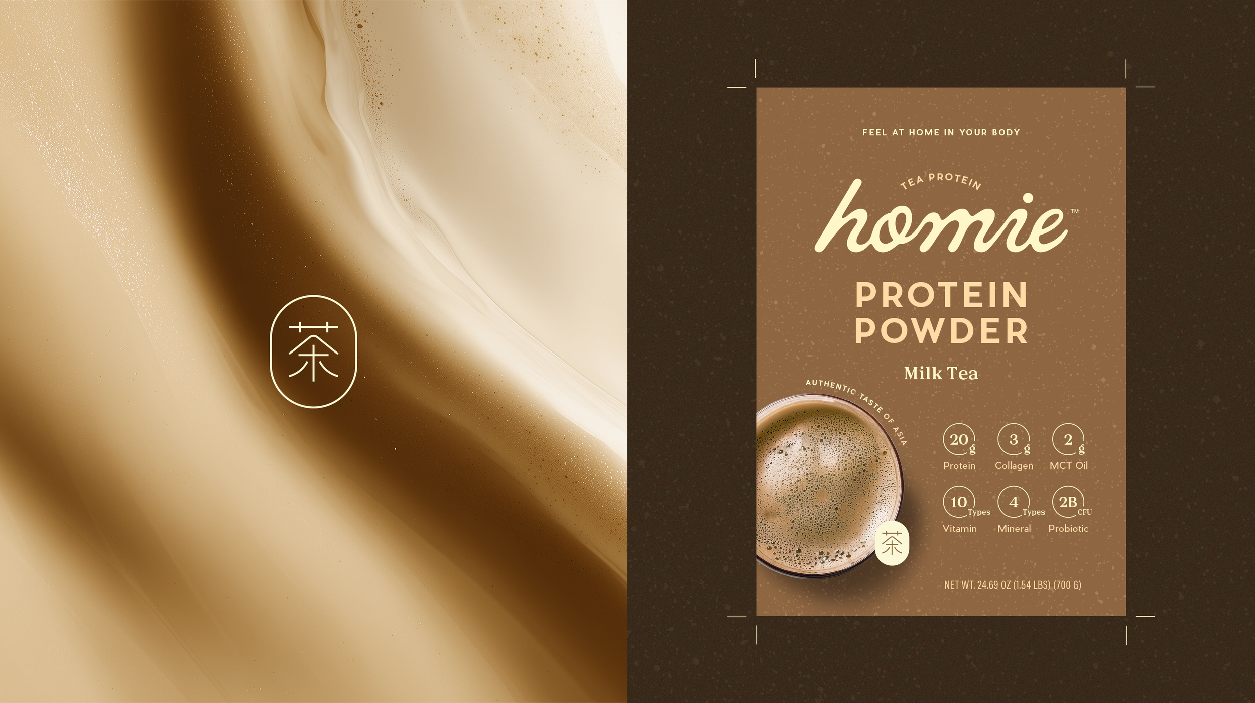
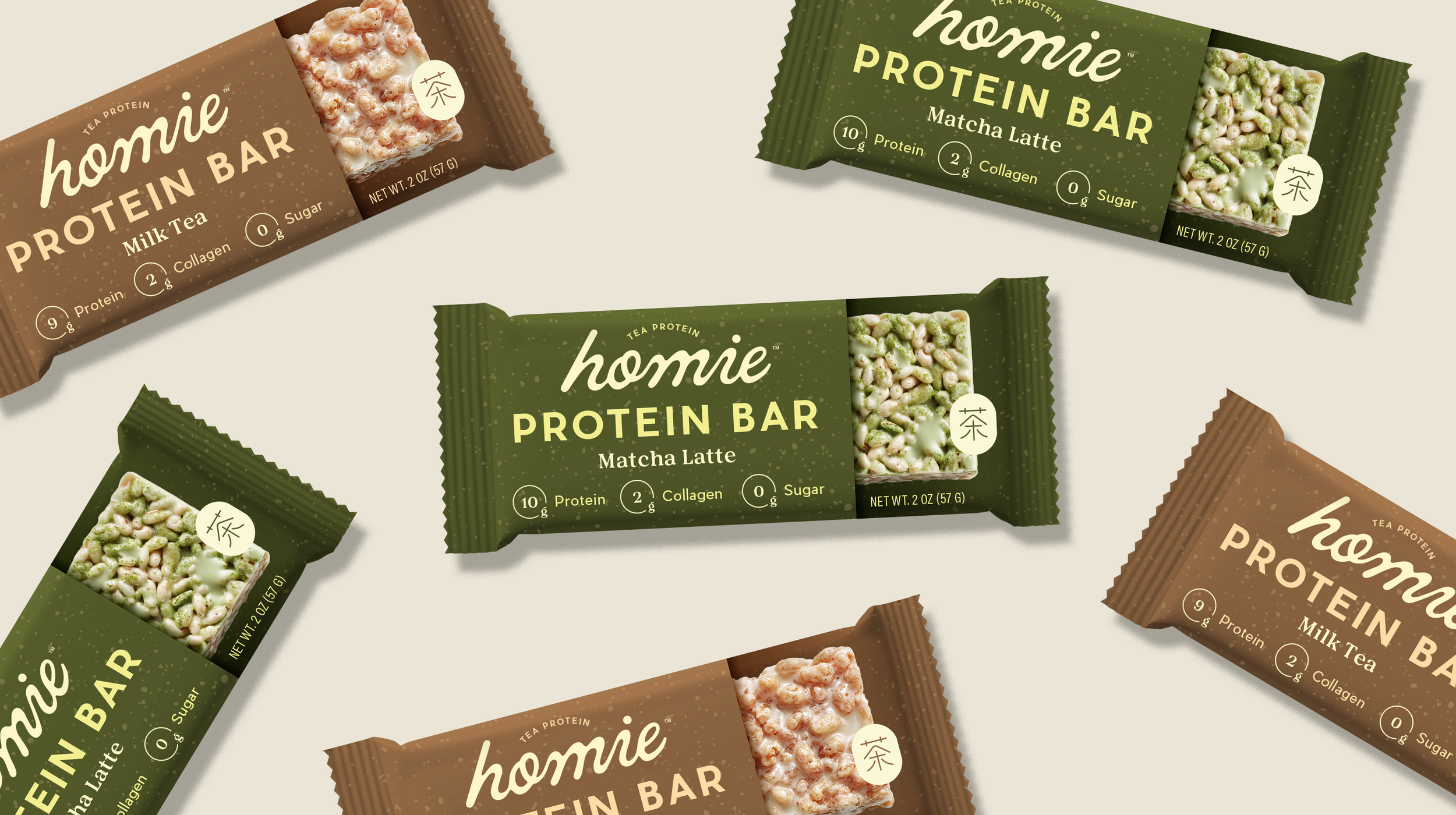
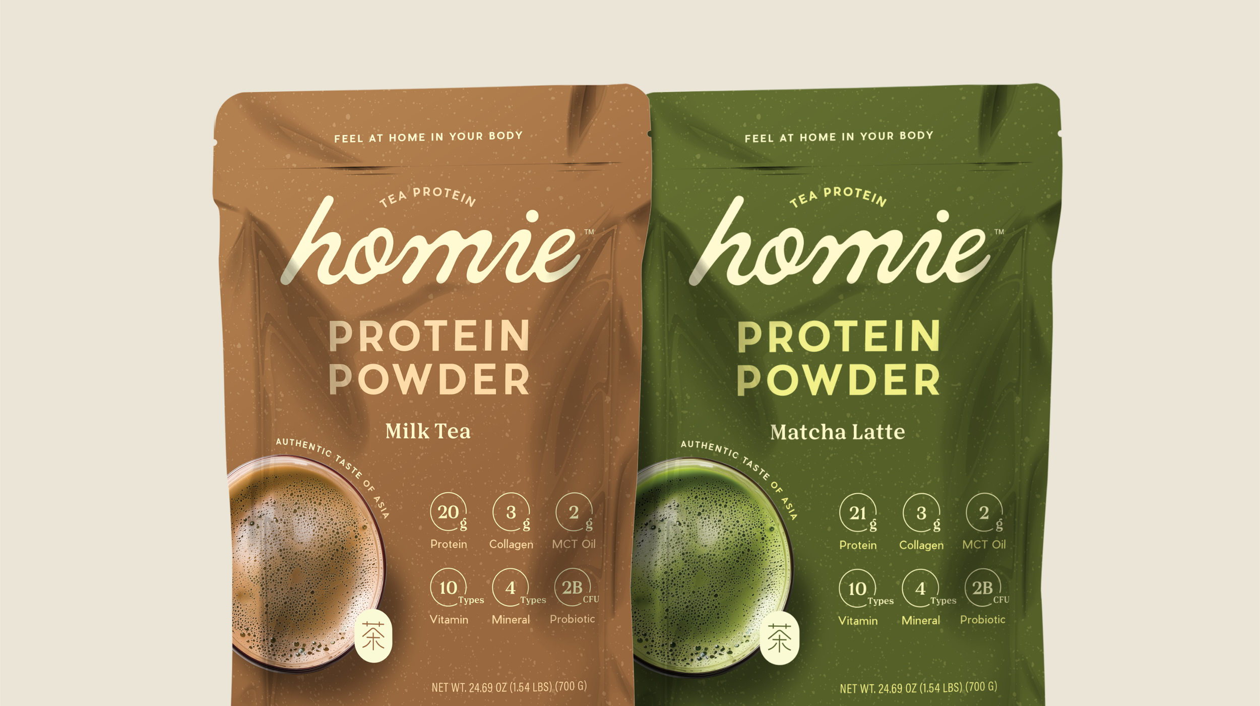
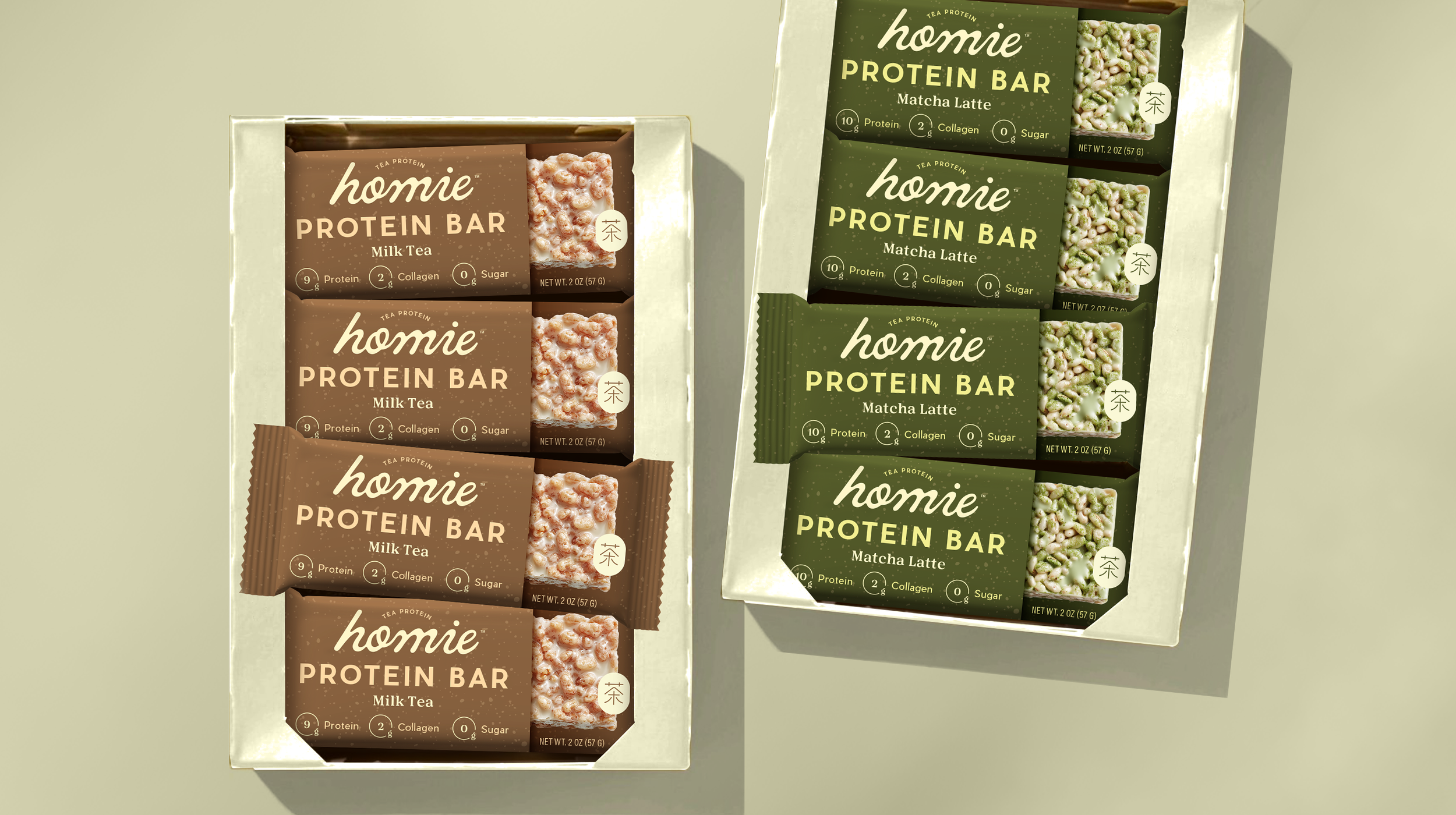
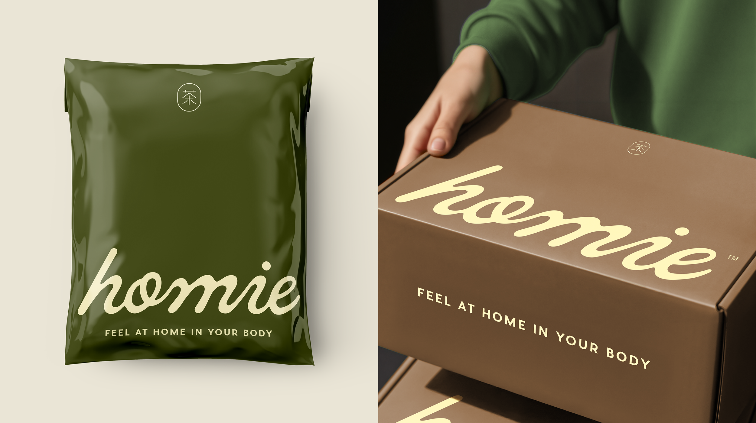
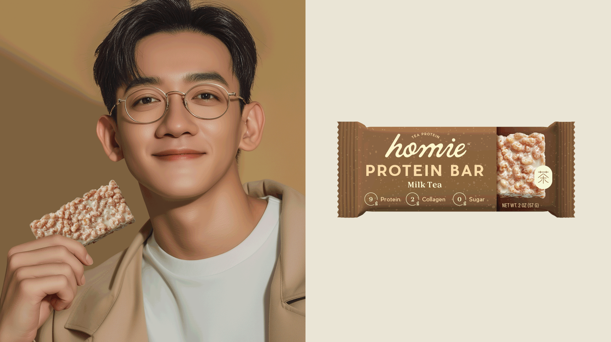
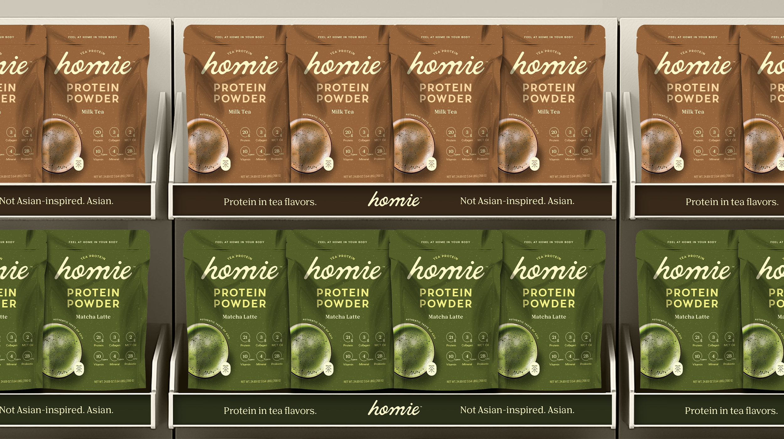
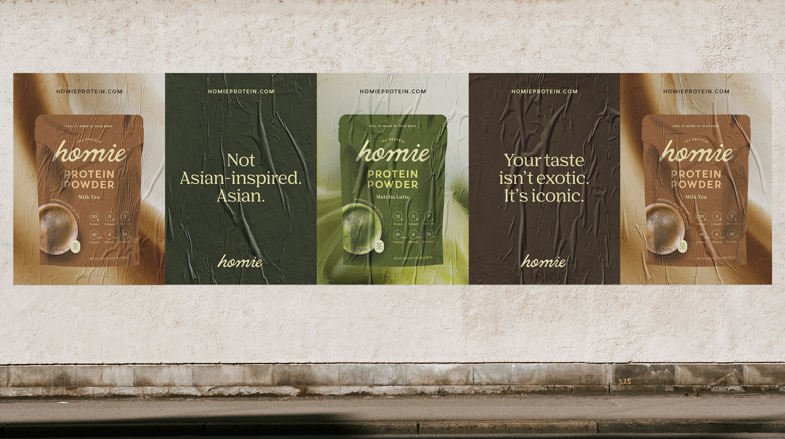
I helped name the brand ‘Homie’ to reflect the brand’s essence—created by Asians, for Asians—and the rest of the design direction follows to reinforce the shared impression consumers have with tea. From the smoothness of the logotype to the earthy color palette and the gritty texture inspired by the tea leaves, every detail brings a touch of an authentic tea-drinking experience.
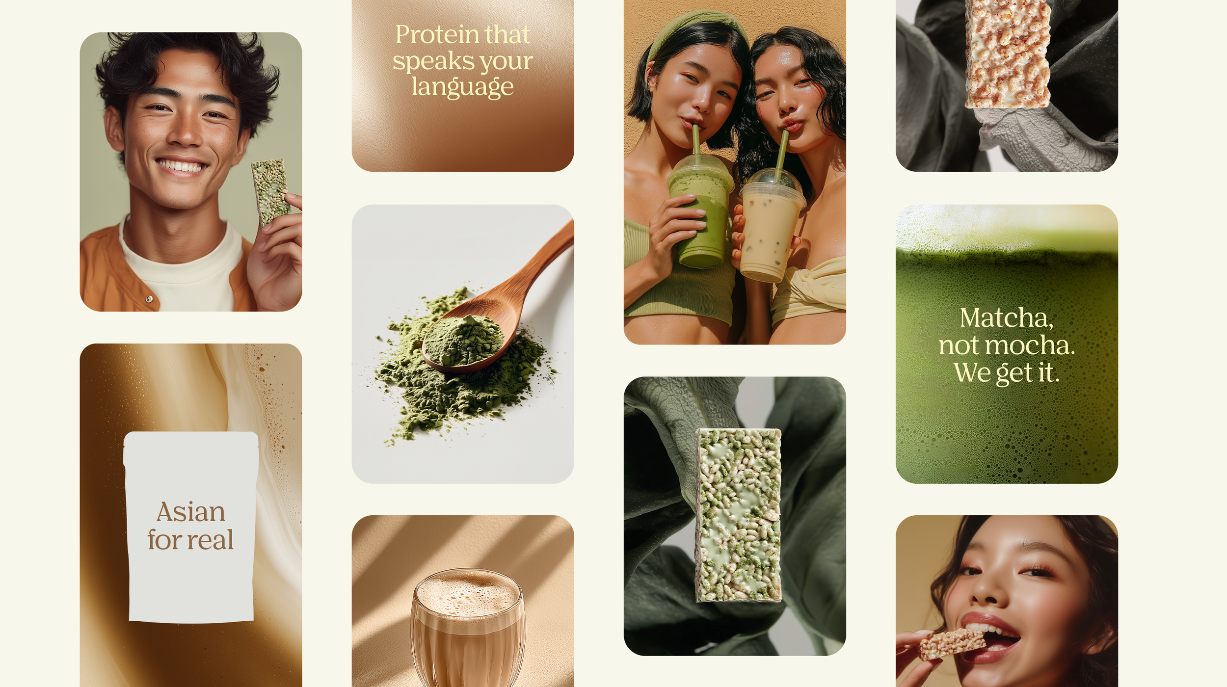
With an indulgent imagery that stimulates the appetite, clean typography that communicates functional benefits, and an emblem of “tea” character in Mandarin to honor its Asian roots, Homie’s design system is not only rich in storytelling, but also is strategically systemized to scale seamlessly in the future as the brand grows.
Let’s Work Together
Discover what’s possible for your brand