Bright skin powered by advanced bioscience
Clariderm
Creative Direction, Visual Identity, Packaging, Art Direction
Brief
Conceptualizing a market-specific skincare solution
I was invited by the marketing team of a global beauty powerhouse to partner on an innovation initiative: translating market insights and cultural standards of beauty, then developing an innovative skincare concept tailored for the Asian market, where brightening and whitening products play a significant role due to regional beauty standards.
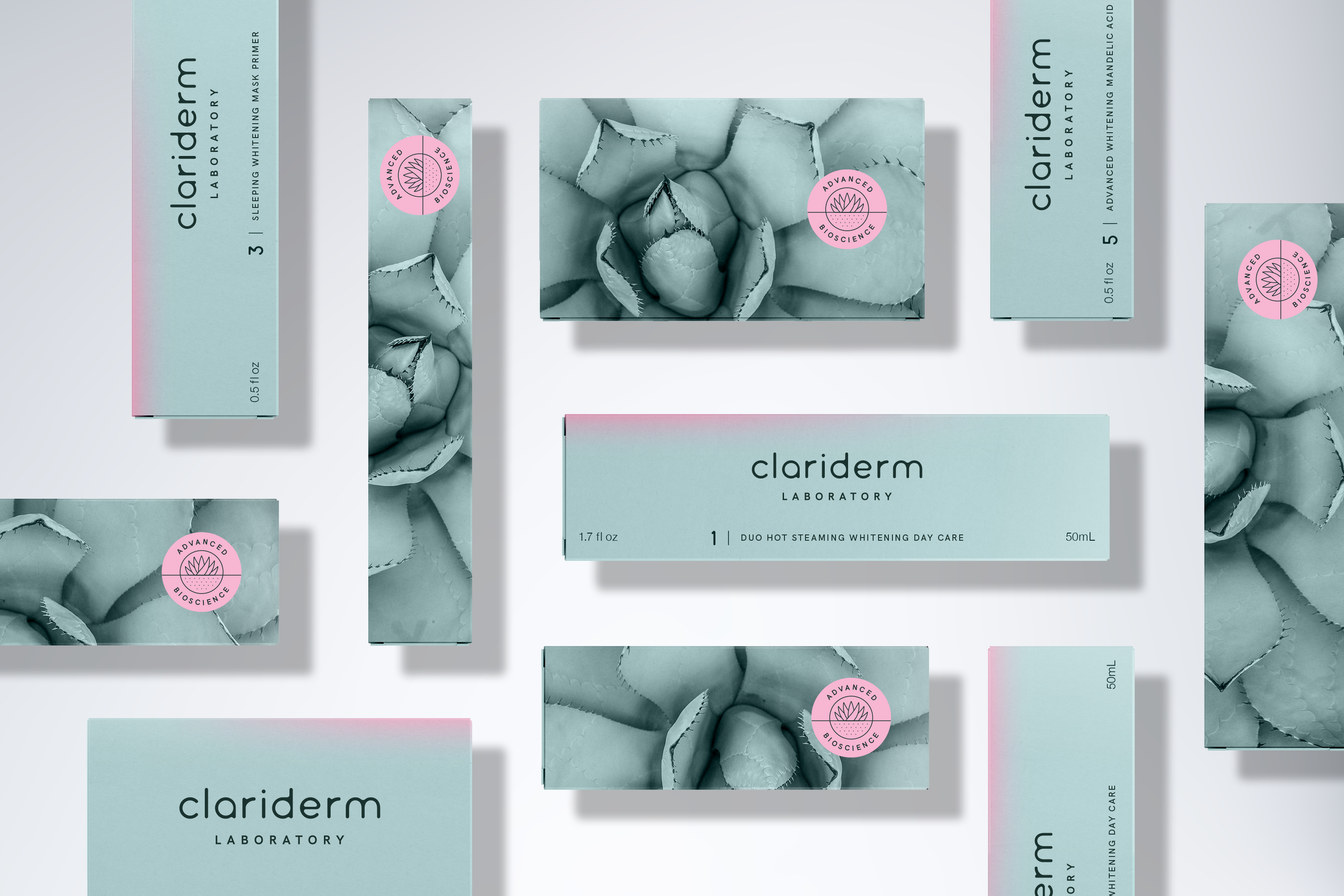
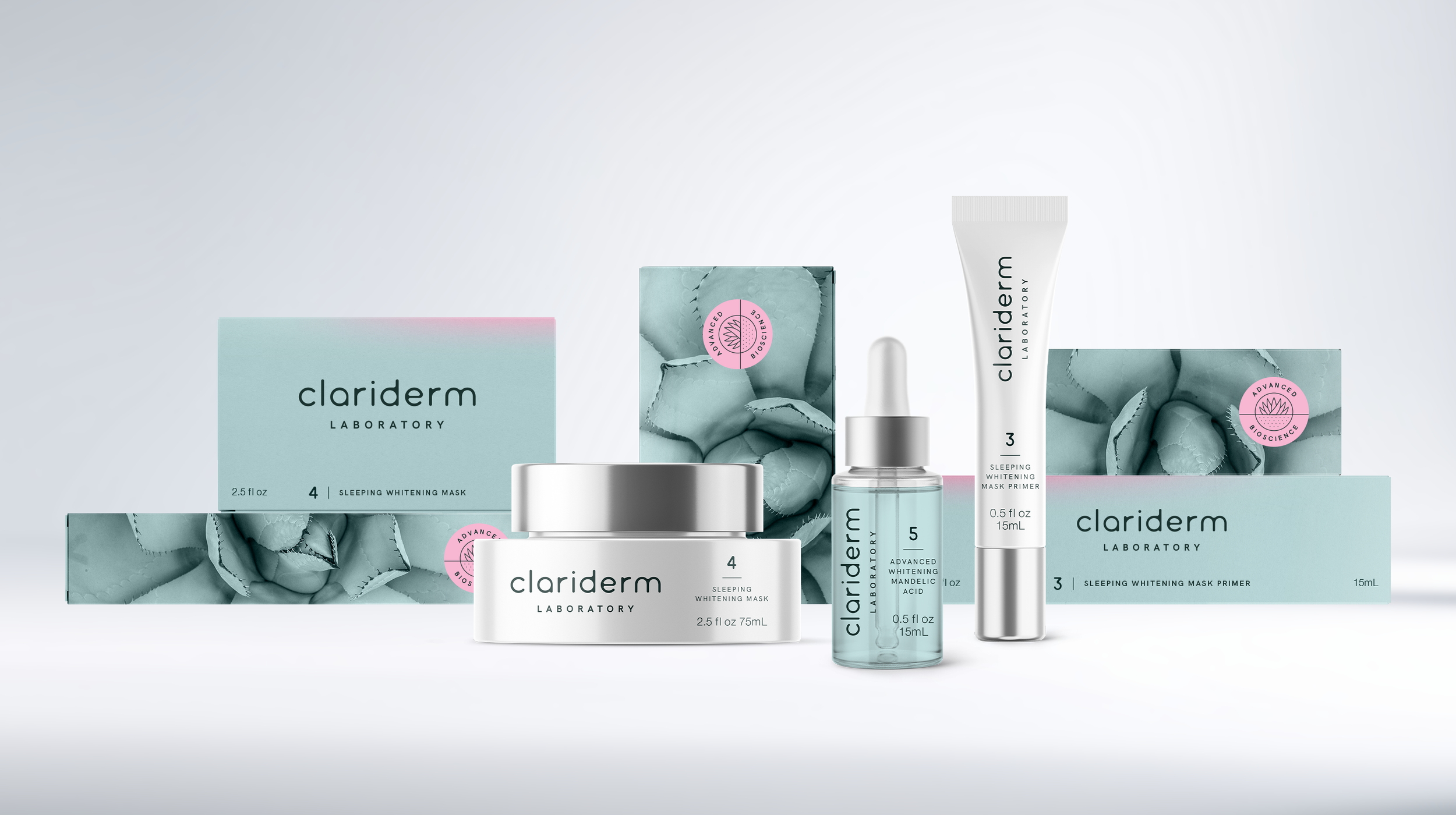
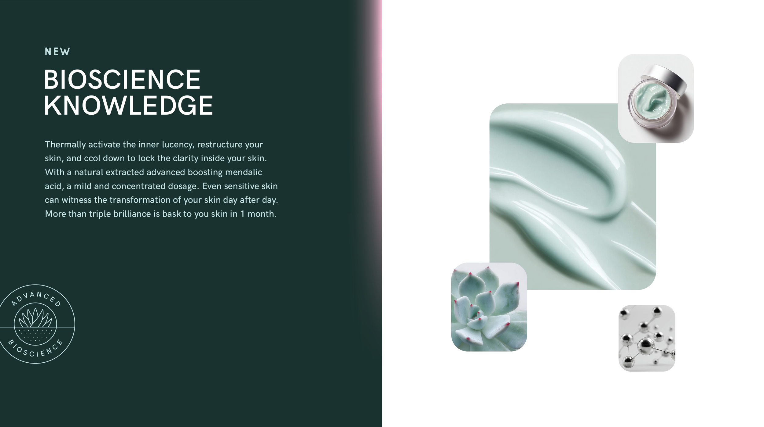
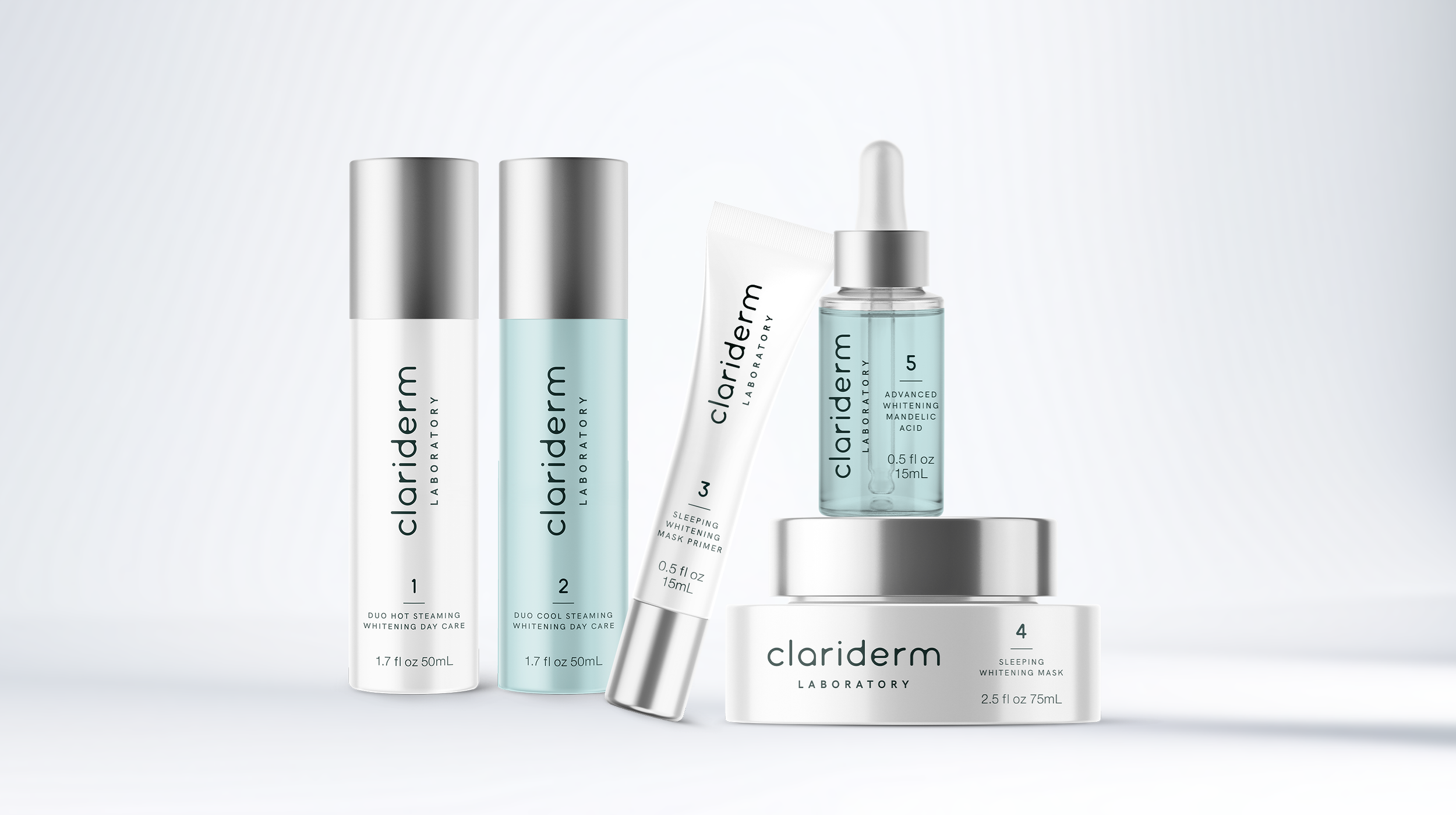
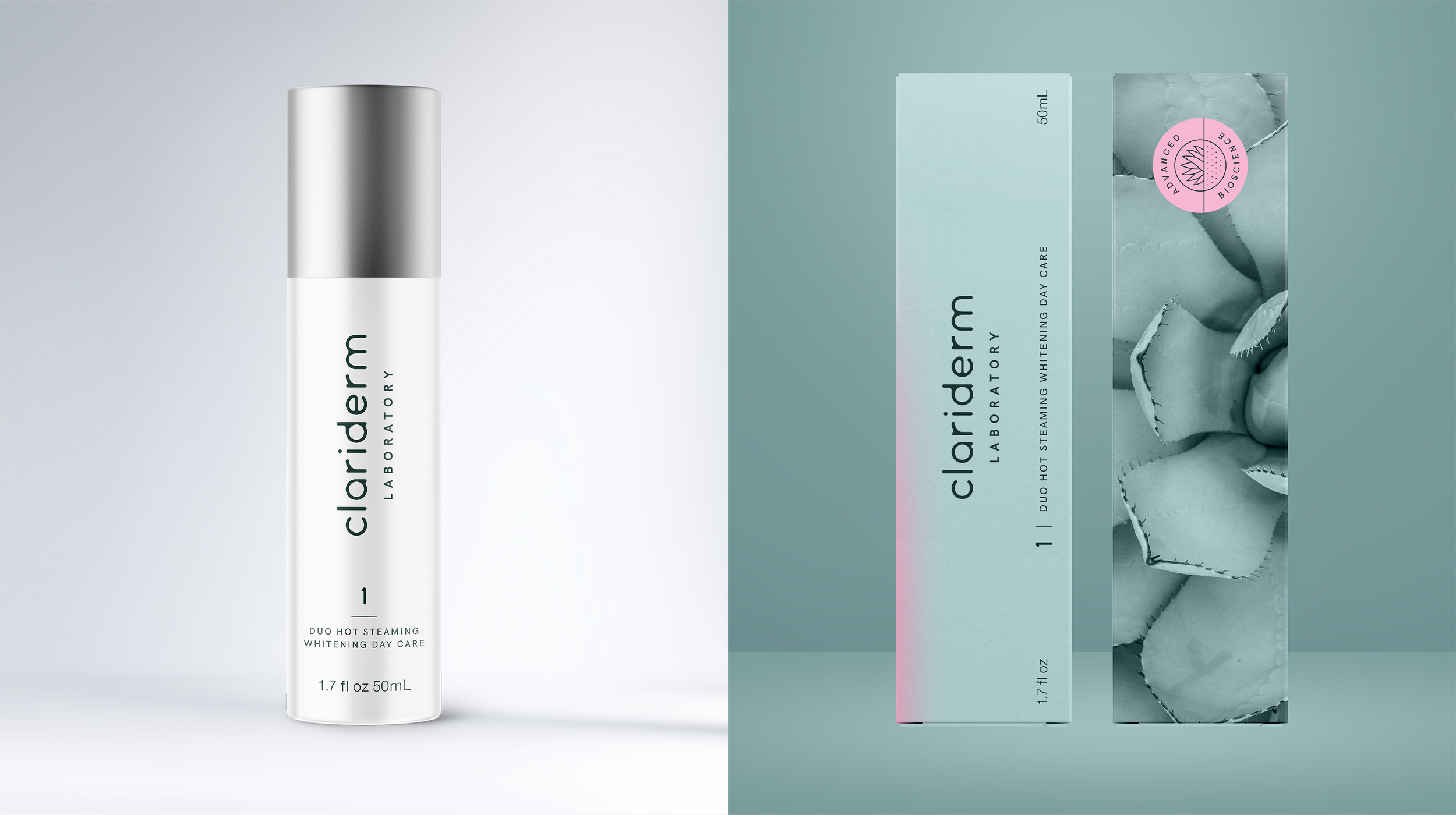
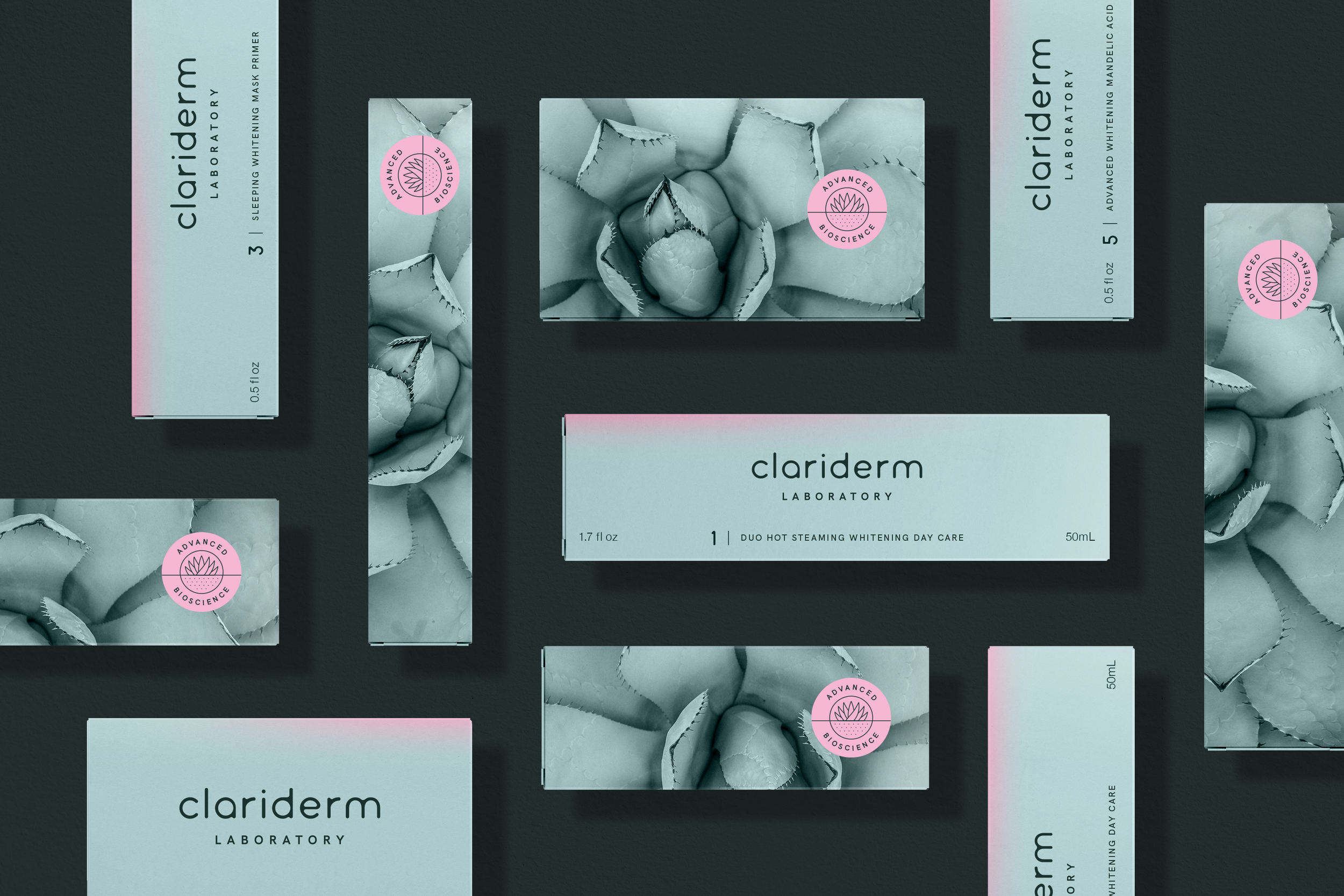
Rooted in new bioscience innovation, specifically the advanced research on the porcelain plant, the brand required a visual identity that struck the right balance between scientific credibility, nature and beauty, while visualizing the whitening effect and communicating its impact clearly and effectively to consumers.
Creative Direction
Harmonizing science, nature and beauty
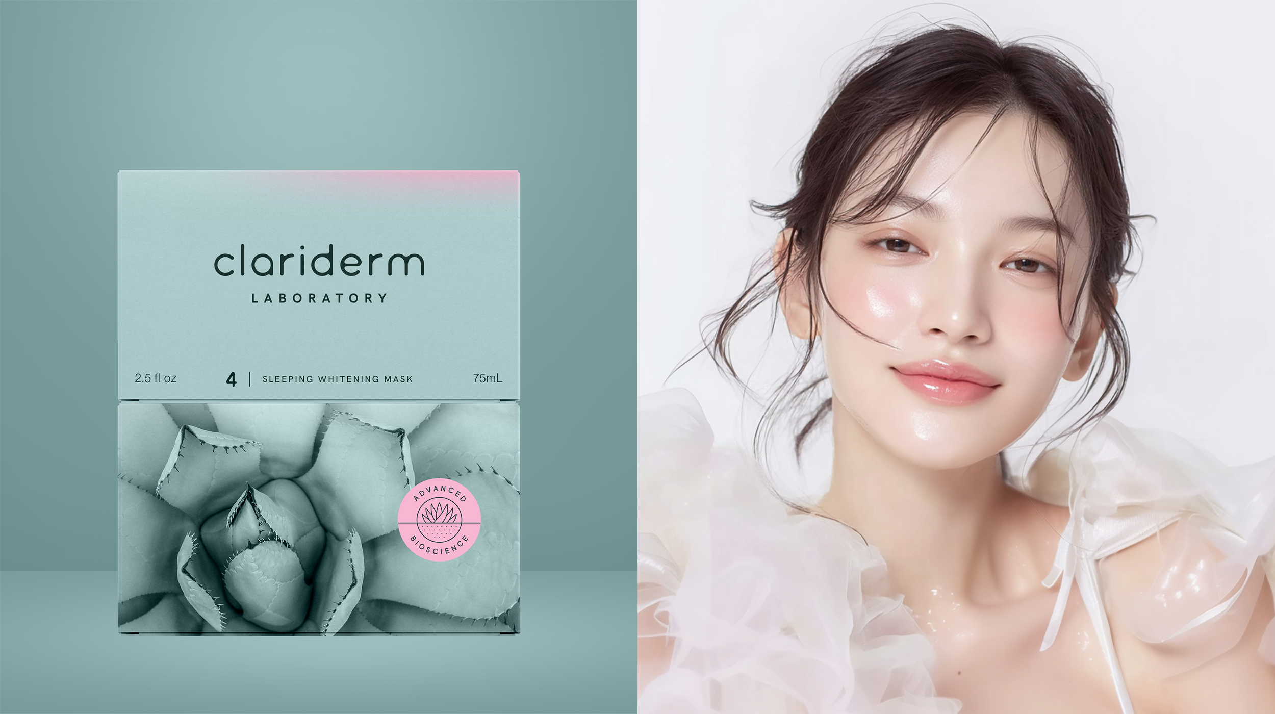
To achieve the right balance of science, nature, and beauty, the visual identity uses clean typography and clinical layout to communicate scientific credibility. Nature and beauty are conveyed through the color palette, with teal drawn from the plant’s body and vibrant pink highlights adding contrast and subtle beauty. When paired with white, these colors even enhance the brightness and perceived purity of the white.
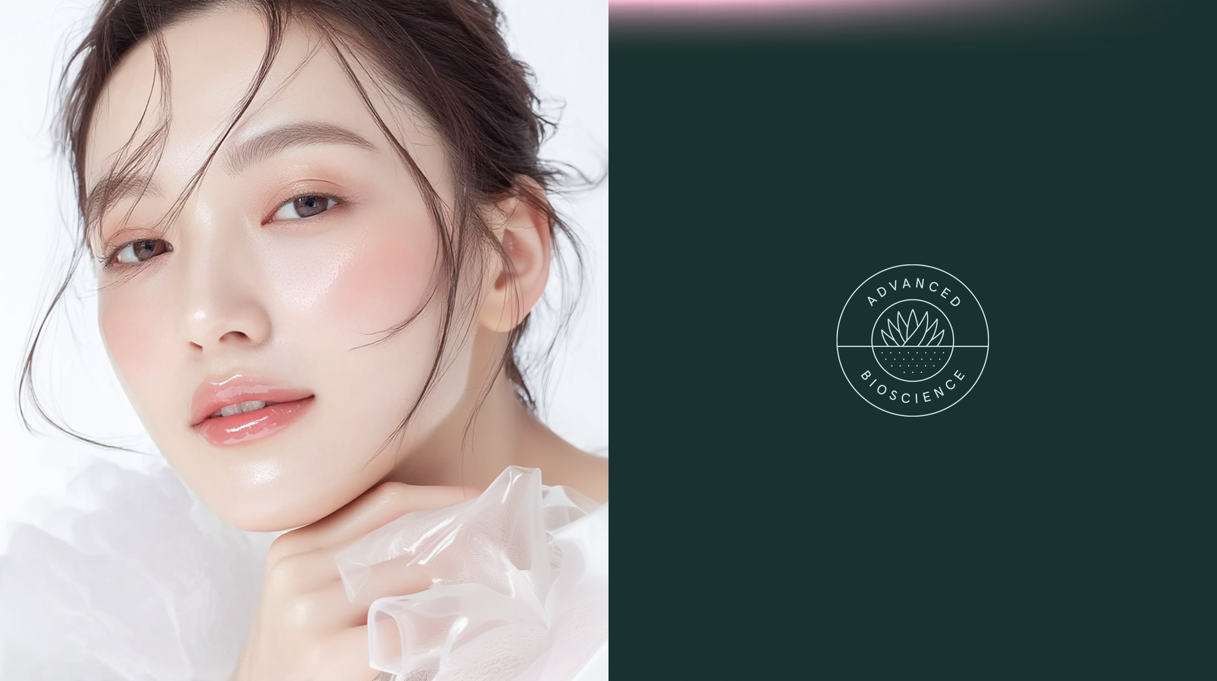
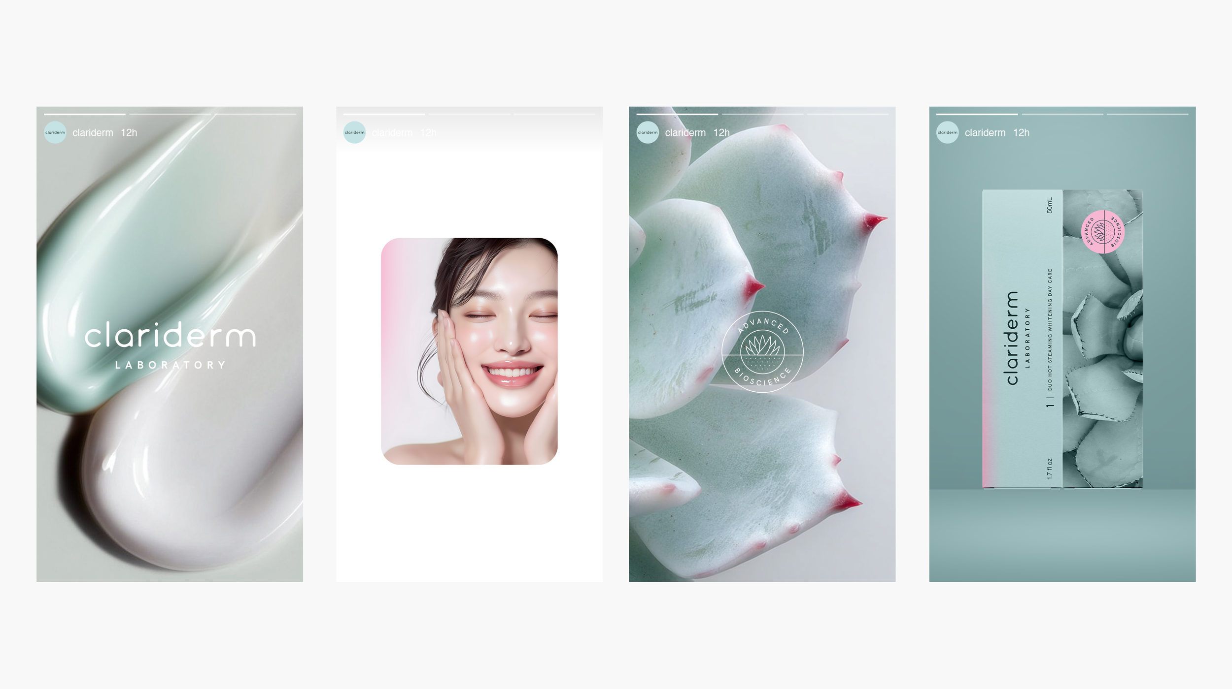
The art direction was shaped by the whitening effect, depicting Asian women with luminous, dewy skin and confident feminine energy, while soft, bright overlays highlighted the transformative results of Clariderm’s products.

“Hsiao fed the team with lots of insights and inspiration. Her communication skills stood out. Despite the distance between Paris and New York, Hsiao still rapidly caught the essence of the context and design direction. It was a true pleasure working with her.”
Sharon Wang / Project Manager
Let’s Work Together
Discover what’s possible for your brand